top of page


Design a friendly app to help people navigate cycling
UX-UI Personal Project

Concept
The need
Every time I come to Tel Aviv, I get around by bicycle. It's the most convenient way to navigate the city,
as traffic flows smoothly and there are fewer parking problems compared to driving a car.
The desire to raise awareness and promote the idea of cycling as the primary mode of transportation
led to the creation of 'Speedy,' a dedicated navigation app for bicycles and scooters.
During my first course of studies, we were assigned a project to develop a navigation application.
Immediately, I envisioned guiding users through bicycle lanes as a green solution
that provides a safe, comfortable, and efficient riding experience
The Idea
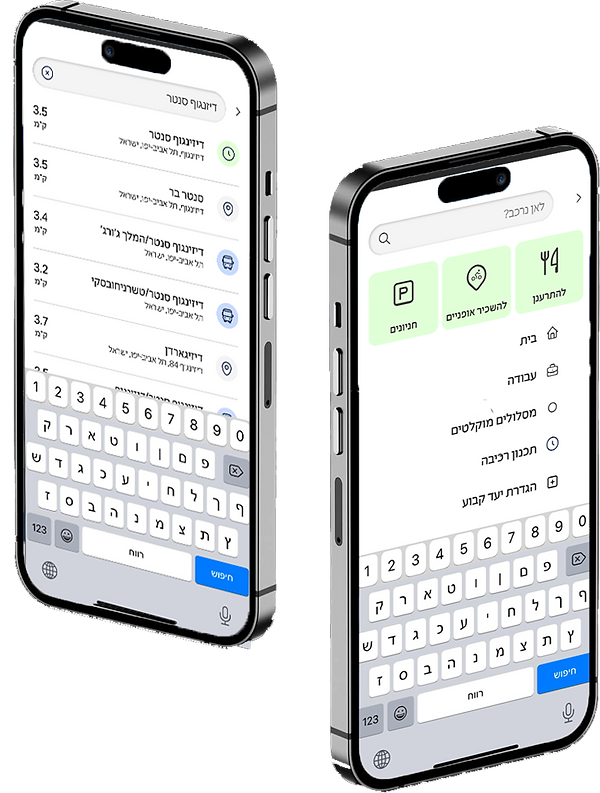
Creating a navigation app with a map adapted for two-wheeled riders within the city.
The problems
Today, there is still no dedicated application that utilizes GPS services specifically for cyclists. As a result, many cyclists are often unaware of the most convenient routes to their destinations, putting themselves at risk on the road due to insufficient familiarity with designated bicycle paths.
Quantitative research
Ask the cyclists
115 people answered the questionnaire, that's an insane number!
I asked some questions and got really interesting answers
that made a lot of conclusions and helped me get the job done.
Analysis and insights
The solutions
After gaining a thorough understanding of the pain points experienced by my users, I devised creative and convenient solutions
-
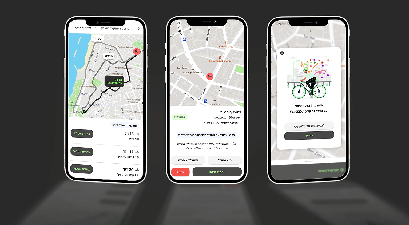
A map navigation service specially adapted for two-wheeled vehicles.
-
Safe routes of bike paths that shorten the way to a destination.
-
Maintaining environmental quality.
-
Encouraging aerobic activity by a feature that shows the user his calorie burn and enables a sequence of activity over time.

User testing
Where are the areas for improvement?
After all the hard work, I'm excited to test the app with four real users. I strive to provide the best experience for the users.Here are the results-
-
The users mentioned that they do not currently use a dedicated cycling navigation application.
-
One of the users encountered difficulty in understanding the pop-up icons.
-
To address this issue, I added explanatory captions and relocated them to pages relevant to the search.
-
All users were able to register on the interface easily and conveniently.
-
All users were able to navigate to their destinations with ease and comfort.
-
During the initial user test, the first user encountered some technical problems that have since been resolved
Design
The way to ride a bike!
The final step was to create an appealing user interface for the application. I opted for a vibrant primary color, bright green, which evokes a sense of "green light" - the ideal and most favorable path. For the secondary colors, I combined lighter shades of green and black.


bottom of page


